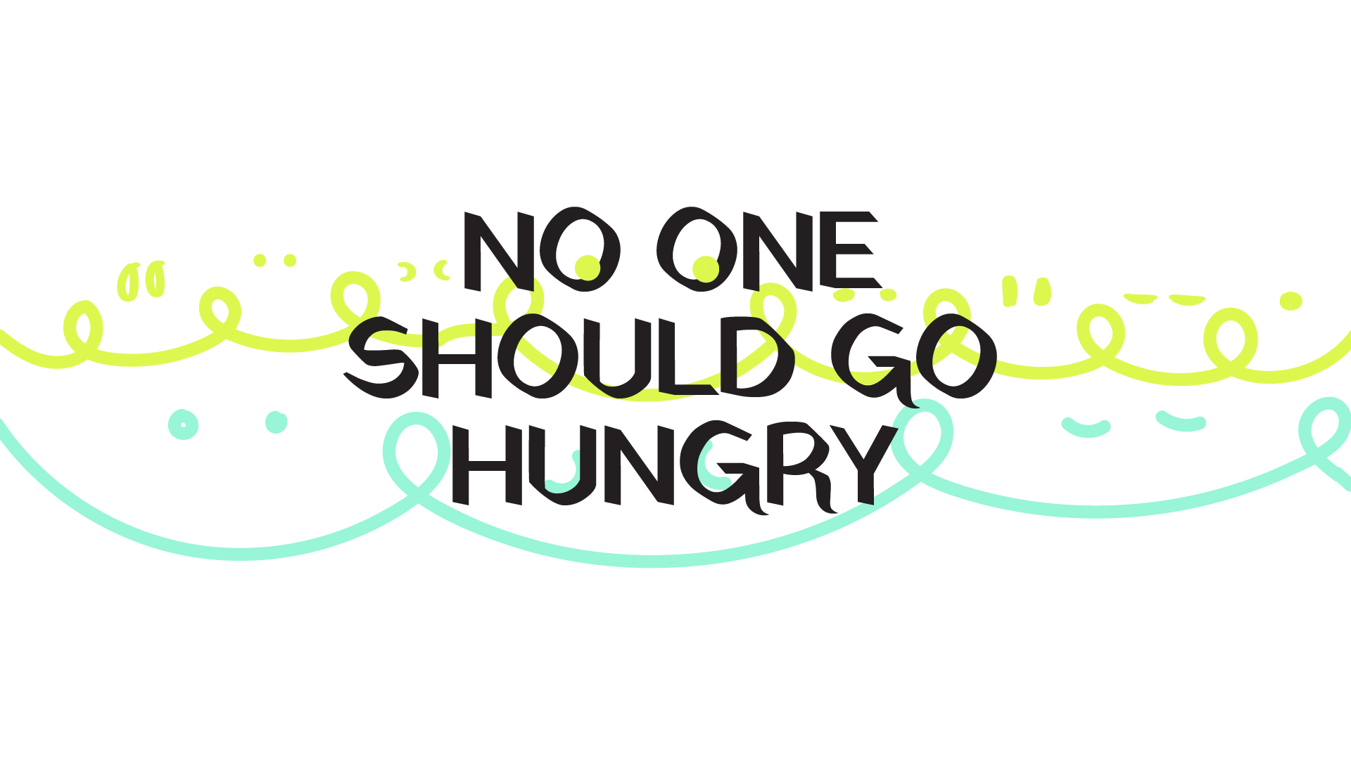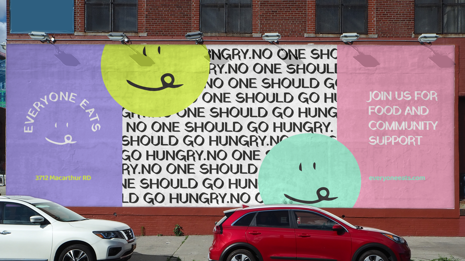
More than just a food charity, EVERYONE EATS is a vibrant community in New Orleans that is dedicated to eradicating hunger while fostering a spirit of justice, dignity, and collaboration for all. At the core of the brand lies the belief that everyone deserves access to nourishing meals and the support of a caring community. Guided by this mission, the brand not only provides essential food deliveries but also strives to educate and empower individuals on the issues of food poverty and waste. The ultimate goal is to create a world where no one goes hungry, and where diverse voices unite in solidarity to uplift and support one another.
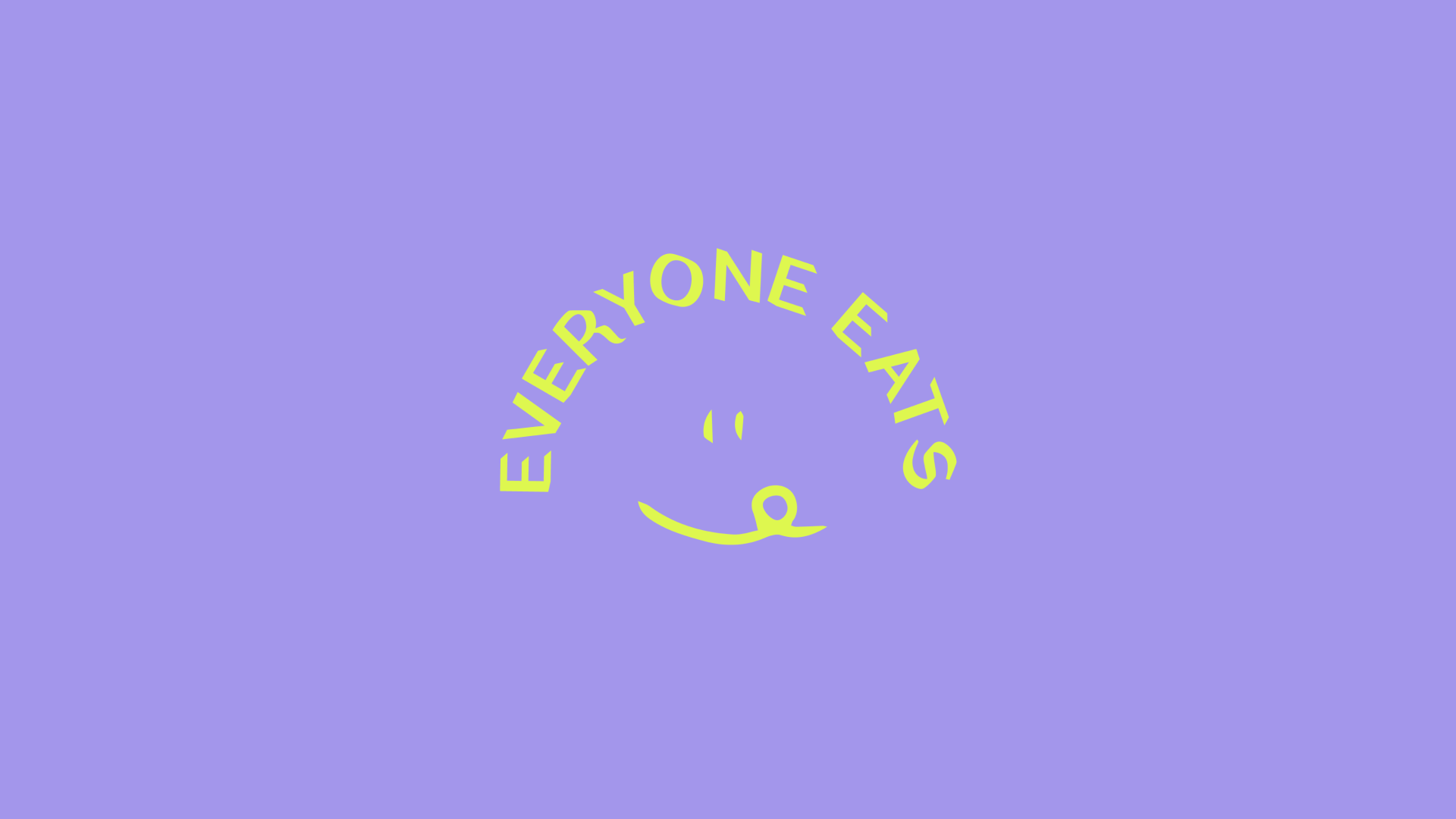
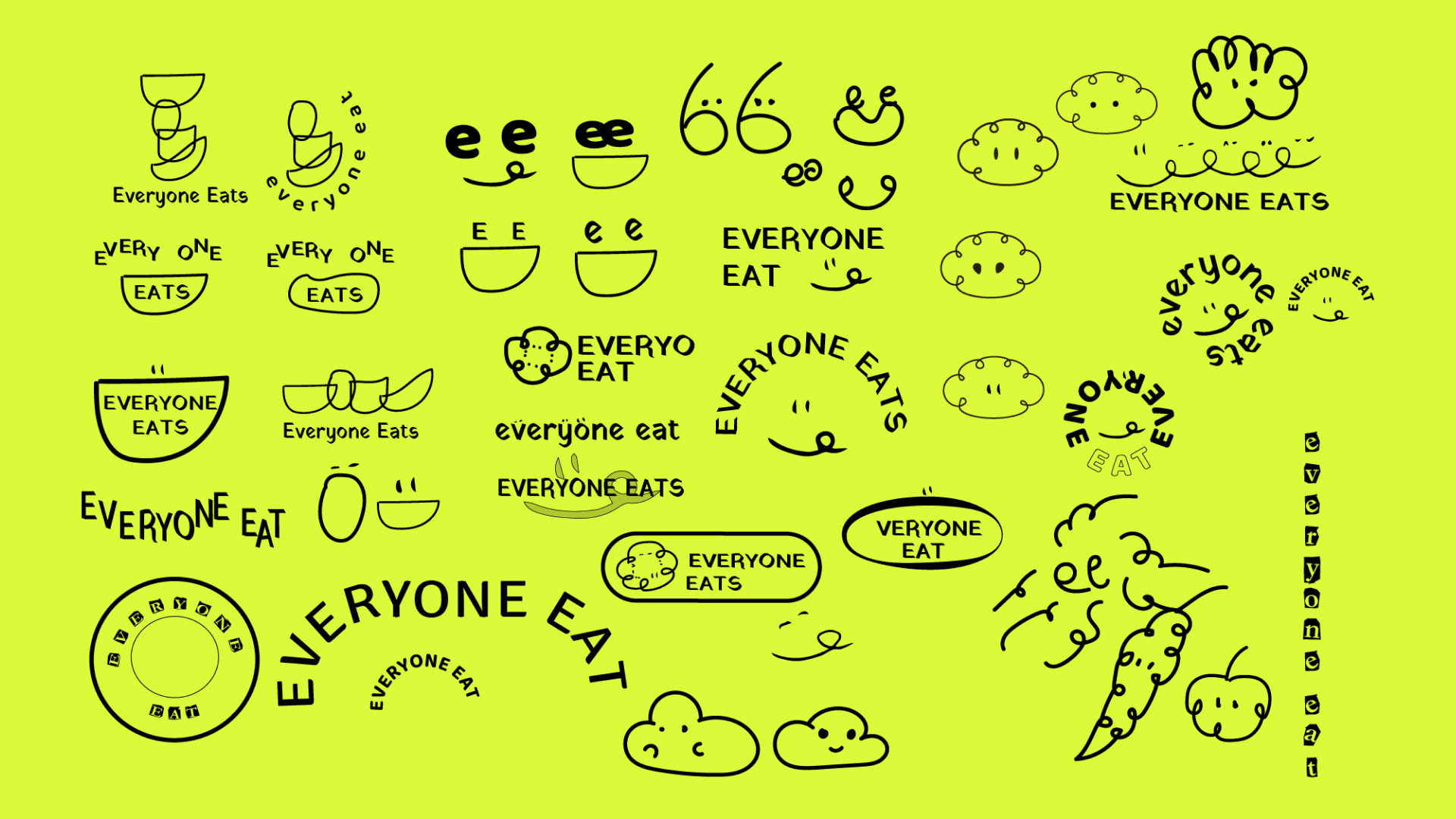
To embody the inclusive and uplifting spirit of EVERYONE EATS, I embarked on a branding journey rooted in connection and joy. Drawing inspiration from the vibrant colours and festive atmosphere of Mardi Gras, we infused our brand palette with hues that evoke a sense of celebration, love, and life. Bright, cheerful tones and playful lines and shapes serve as visual reminders of the boundless possibilities that arise when communities come together in solidarity. Central to our brand identity is our logo—a cheerful face savouring a meal—a universal symbol of happiness and nourishment. Designed to be responsive and adaptable to various contexts, our logo reflects the warmth and inclusivity that define EVERYONE EATS. Through the vibrant branding, EVERYONE EATS invites all to join in spreading hope, love, and nourishment to those in need.